Claim
Contrast first, hue second
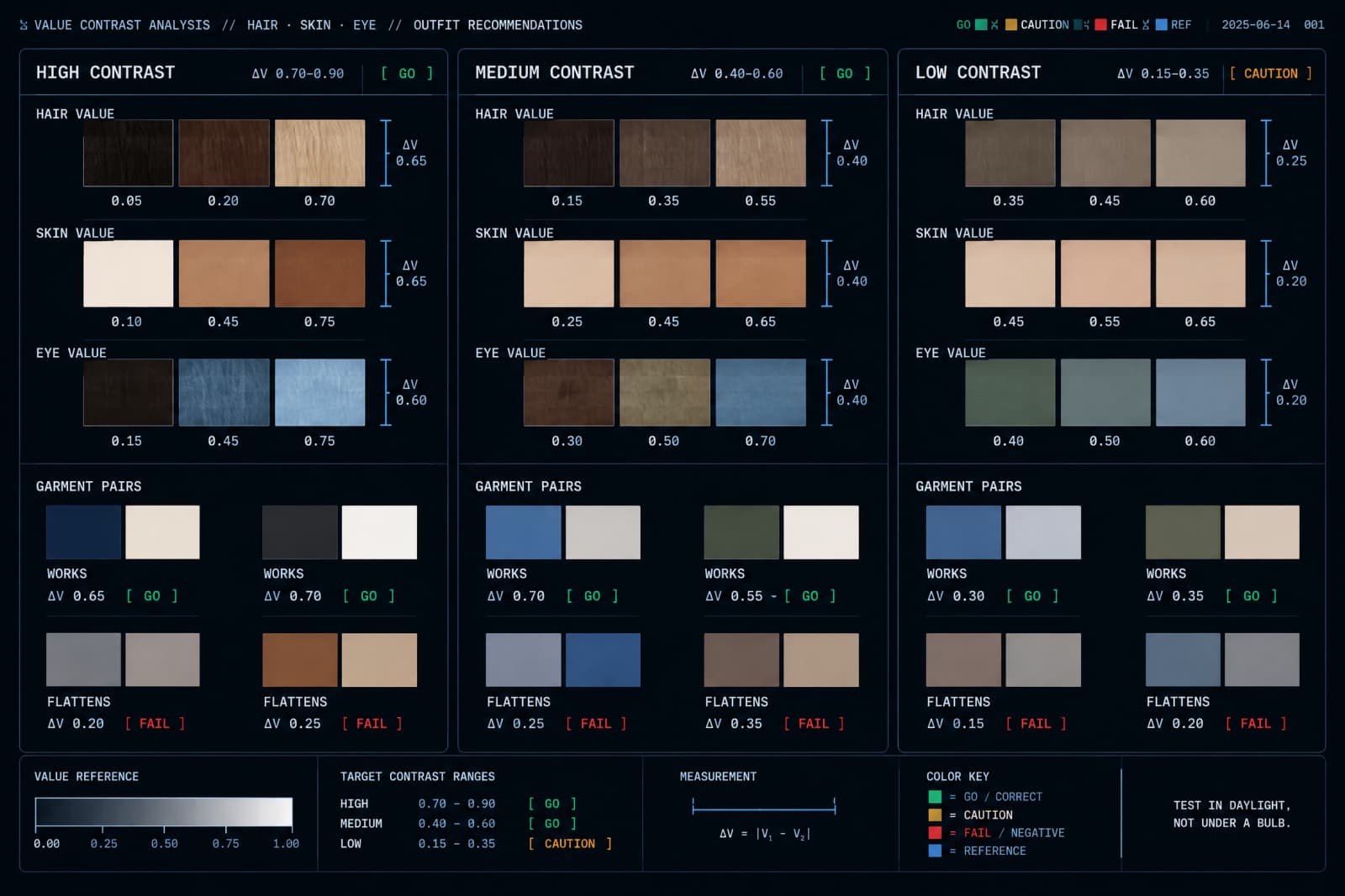
Personal contrast is the difference in lightness between your hair, your skin and your eyes. Dark hair with pale skin is high contrast. Sandy hair with light skin and light eyes is low contrast. Mid brown hair with mid tone skin is somewhere in the middle.
Why it matters: an outfit with more contrast than your face will pull attention away from you and onto the clothes, while an outfit with less will look washed out on a high contrast man. Matching the contrast of what you wear to the contrast of your face is the single most useful color rule I know, and almost nobody is taught it.
Evidence
Undertone, and how to actually see it
Undertone is the underlying cast of your skin, usually described as warm, meaning golden or peachy, or cool, meaning pink or blue, with neutral in between. It is independent of how dark your skin is.
Two checks that work better than the vein test people repeat. Hold a plain white sheet of paper next to your bare face in daylight and see whether your skin looks yellowish or pinkish against it. Then compare a pure white shirt with an off-white or cream one in the same light: one of the two will make your face look healthier and the other slightly gray, and the difference is usually obvious once you look for it directly.
Action
Run the daylight test with four items
Stand by a window in daylight, no overhead bulb, and hold four things you own up under your chin one at a time: something black, something navy, something white, something cream or beige.
Look only at your face, not the garment. You are looking for two things: whether the shadows under your eyes deepen, and whether your skin looks even or blotchy. Photograph each one. The differences look subtle live and are unmistakable in the photographs, which is why you take them. Write down which two of the four were best and which was worst.
Claim
Build from three or four colors, not from a wheel
You do not need a palette. You need a small set that works together, which for most men is two or three neutrals plus one or two colors.
Neutrals are the colors that combine with everything: navy, gray, black, white, cream, olive, brown and denim blue. Pick the neutrals that passed your daylight test and treat them as the base of everything. Then add one or two colors you actually like for shirts and knitwear. The reason this works is combinatorial: four items that all share a base go together in every direction, and twelve items chosen individually often do not.
Caution
Black is not the safe default
Black is treated as neutral and formal and flattering, and for a good number of men it is the least forgiving color available. It is the extreme end of the value scale, so on a low contrast face it overwhelms, and on tired skin it emphasizes gray.
Navy and charcoal do almost everything black is asked to do with less cost. Test it properly with the daylight photographs rather than trusting the reputation. And if black works on you, which it does on plenty of men, keep it. The point is to know which case you are in rather than inheriting a rule from a magazine.
Example
Michael wore black shirts for a decade because someone told him at twenty-two that black was smart. He has fair skin, light brown hair and blue eyes, which is low contrast.
In the four photographs the black shirt was the worst of the four by a margin neither of us expected. His face lost definition and the shirt dominated. Mid blue and olive were both visibly better. He did not throw anything out. He stopped buying black shirts, bought two mid blue ones, and reported that people began commenting that he looked well rather than that he looked smart. He finds that distinction slightly annoying and also true.
Aside
What color analysis actually is
The commercial version of this, where a consultant assigns you a season and a fan of swatches, is not a validated science. The categories differ between systems, the analysis depends on lighting and on the person doing it, and no controlled literature supports the specific taxonomies.
What survives is duller and checkable: contrast levels are real and visible in photographs, and some colors measurably reflect light onto your face in ways that others do not. So use the window and the camera rather than paying for a diagnosis. If a consultation helps you look at yourself carefully for an hour, it may be worth the money for that reason alone, which is not the reason it is sold.